Wednesday, 8 December 2010

poor Griselda

Photobucket
A Tale from the Decameron by J.W. Waterhouse

If there’s one good reason why the major public museums ought to stay free, it’s so I can pop in for a half hour or so whenever I’ve got a half hour to spare. Unlike the monumental Louvre, which calls for a more serious approach (at least one glass of wine for every 45 minutes of browsing), the National Gallery’s manageable size and free-entry policy means that a once a week breeze through isn’t just doable but downright enjoyable.

I know where my favourite pieces are and I know the best routes to get to them – e.g. I always stop off for a woozy sigh of delight in front of the Wilton Diptych before heading round to dally in front of The Arnolfini – but sometimes when I’m whizzing round, I notice a new piece, or at least a piece that I think is new. Yesterday afternoon, I noticed lots of works I hadn’t seen before but when I investigated further to see whether there was a list of curatorial changes and rotations to confirm my suspicions, I was greeted with mostly blank stares. “Oh yeah, the curators are in most mornings moving things about here and there,” I was told by one friendly information assistant. Not so helpful, then.

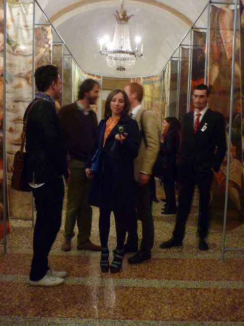
Excepting the wonderfully serene feeling I got from wandering through the Sainsbury Wing, the highlight of yesterday’s jaunt was a series of three fifteenth-century (1493-4) Italian paintings on the tale of Griselda which were supposedly displayed in a Sienese palace.

Photobucket

Photobucket

I love the characters in the panels, the nod to Botticelli’s women and the peculiar animals set into the foreground. I love the zoom technique where the arch in the first panel becomes the setting for the second and third panels. I love that the viewer is intended to read the paintings as one would read a story – from left to right, with multiple incidents from the narrative occupying the same panel. As with most paintings, the digital reproductions simply don’t do them justice.

Photobucket

Photobucket

Photobucket

Photobucket

Incidentally, the story of Griselda is rather amusing. If you’ve read Chaucer’s “The Clerk’s Tale” it may sound familiar, but I know it from Boccaccio’s Decameron (the Decameron is a stonking good read and would make an excellent Christmas present, or if you haven’t read it, do yourself a favour a purchase a copy immediately!).

The story goes a little like this: the lovely lady Griselda marries the Marquis of Saluzzo, Gualtieri, who turns out to be quite bonkers. In order to test her wifely devotion, first he declares that both of their children must be put to death and then publicly renounces Griselda for a more noble woman. Little Miss Perfect is wounded by her husband’s actions, but patiently accepts his wishes and goes to live with her father. About twelve years later – TWELVE YEARS! – Gualtieri announces that he’s got another grande dame and wishes Griselda to return to him as a servant in order to prepare for the wedding. So far, so creepy. Griselda returns only to be introduced to Gualtieri’s new bride, a twelve-year old girl. Griselda wishes them both well, at which point, ta da!, Gualtieri reveals that the girl is really their daughter and not his bride-to-be. Gualtieri tells Griselda that the whole thing was one insanely ludicrous plot to find out whether his wife was as faithful as all fourteenth-century wives ought to be. They then live, presumably, happily ever after…
Photobucket

Monday, 6 December 2010

pastificio londra

Photobucket

While you'd be forgiven in thinking that the food as art and design trend is just a flash in the pan to Sunday supplement readers, the projects of Florentine food group, Arabeschi di Latte, are something special, and given that they've been around since 2001 and only seem to be getting (deservedly) more popular, hopefully this is one trend that won't flutter away.

Photobucket

Photobucket

My first introduction to the lovely ladies of di Latte came via another stylish woman, Faye Toogood of Studio Toogood, who brought AdL over for her installation at Tom Dixon's The Dock during the London Design Festival in 2009. While Faye's modernist building blocks were good fun, the pop-up Egg Bar was what really tickled my excited bone: visitors had to choose a recipe card and then prepare the egg and bread, before one of the di Latte's cooked the egg according to your preference. Egg duly cooked, it was added to the rest of the ingredients before being greedily devoured. On the evening of the press preview, after quite a few glasses of champagne, a delicious do-it-yourself poached egg on toast was not only most welcome (there's not enough food around during the London Design Festival), but also incredibly convivial - I found myself chatting to Faye and to other guests, swapping eggy recipes and laughing at the peculiarness of it all.

Photobucket

Photobucket

I eagerly awaited their re-appearance at this year's LDF and once again, the Studio Toogood/Arabeschi di Latte collaboration did not disappoint. Taking over a lovely little space just off Brompton Road (where Libby Sellers beautifully showed Dick van Hoff's furniture the previous year), Toogood set up as a many-fingered forager: there was a mushroom seller, an olfactory installation, lovely little bags made from binocular cases , Toogood's new line of furniture, as well as a Fromagerie-sponsored, Arabeschi di Latte-run cafe. The cafe was enchanting - a perfect blend of Faye's stylist eye and AdL's unique aesthetic approach - but it didn't have quite the same feel as prior projects, primarily because that oh-so-important element of interaction was missing. Well, not necessarily missing, but you had to shell out about £10 for the privilege of purchasing and then cooking some mushrooms. All very good, but part of what makes AdL's projects so wonderful is that they are free, something that seems to encourage greater participation.

Photobucket

Photobucket

Photobucket

AdL tend to come to London primarily during the Design Festival, so it's nice to see that they're making more trips to London (though given that I'd quite like to carry on doing foody/architecture/design projects, part of me wishes they'd perhaps not have their sights set so stridently on our fair city). Anyway, this latest project was a rework of a pasta bar that recently took place in Tokyo. 

You rock up, pull on a sparkly pink apron, pick your recipe from a selection of about eight little cards, and get to work. There's nothing quite like making a big old mess - it's surprisingly satisfying to get your hands dirty but better than gardening or other such nonsense, you get to eat the fruits of your labour once the mess has been made. We were a bit pressed for time and skipped out a couple of steps (leaving the dough to rest for thirty minutes), but the hob-cooked, pesto-drenched, chestnut-flour pasta still tasted quite delicious. 

As with all of their other events, I've attended, Arabeschi di Latte are sly experts are creating an atmosphere completely stripped of pretentiousness - largely through the consistent execution of their playful design identity - which means that strangers chat and share tips: use a bit more of this flour, if you roll it that way it works better - and the whole thing feels like a bit of a party. Given the proliferation of experimental foodie design groups, the thing I most love about Arabeschi di Latte is that their events bring people together by making food, not just eating it.

Wednesday, 17 November 2010

the art of looking

Photobucket

I’ve lived in Hackney Wick for near on one month now. Given that there’s a superb place for weekend breakfasting within a ten-minute walk and one (only one!) grocer’s shop that sells a lone copy of the weekend Financial Times, I’ve got everything I need. Yes indeed, I’m smitten. Walking around on a blustery Saturday morning, full of potato cake and poached eggs, I love that there’s a quietness to the place but also a feeling that artists and musicians are buzzing away in their fashionably dilapidated warehouses, getting on with the business of making stuff.

Excepting the briefest of visits to Hackney Wicked, I’d never been to any of the Wick’s well-known galleries. I knew there was a show on at the Elevator Gallery that I'd quite like to see, but I couldn't for the life of me find the damned gallery. A kind-hearted man took pity on me and pointed me in the direction of a large red door. The door turned out to be an elevator – ah ha, the titular elevator! – and I went in and closed the gates before pushing #5. There’s no sign in the elevator to tell me what floor the gallery’s on and the lift isn’t moving. I pull back the gate on the other side only to reveal a wall of bricks. Humph. It’s all rather disorientating. Finally, I realise I haven’t shut one of the gates properly and eventually end up at the top of the building. I’ve guessed right and the gallery is indeed on level five. I feel I’ve accomplished something before I’ve even seen the show. A nice way to begin.

I’m already aware of the show’s premise – that the art is concealed within the fabric of the gallery – so I’m chuckling at what looks like dried apple slices or oyster mushrooms stuck to the corner of a partition wall. An invigilator asks me if I’d like to enter the gallery’s competition – prizes are awarded to those who correctly identify the most amount of "actual" work. I take the sheet of paper, pay my pound and take a look around.

It takes me only a few minutes to decide that I won’t enter the competition after all. I've realised that it's not a competition so much as it is a catalyst, a provocateur for looking. A different show I recently attended was comprised of a half dozen works, lovely, delicate paintings, but they neither demanded nor captured my attention. I felt I'd seen all I was going to see after a matter of minutes. The careful construction of the Vanishing Point show means that such an approach simply isn't possible. Here is a show that demands you pay attention, but not a passive sort of attentiveness, like watching a TV drama, but an active and engaged sort of attention - in this show you almost have to make the work yourself. I think the only show I've been to recently where I experience a similar demand was Kit Craig's show at Arcade. I don't think I completely understand Craig's work or what he's trying to do - perhaps part of the reason I find it so striking - but here is an artist who clearly grasps the importance of creating work that demands your full visual attention.

Back at Elevator, the competition masks what must be the gallery’s aim of keeping visitors in the space for a little longer, and incentivising them (how one feels about this is another matter altogether) with prizes for the most works correctly spotted is another clever ruse to get people to really look, instead of take the tickboxyeahseenit approach to gallery hopping.

As with any group show some work is better than others, though this one perhaps more difficult to judge given that you aren't always sure what's work and what's paint dripped down a wall during the last exhibition install. I stumbled upon my favourite piece quite accidentally. I went to grab a press release from a pile on a desk tucked into a corner. There was a pack of cigarettes and a box of matches on the pile, but when I went to move them out of the way I noticed movement - inside the box of matches was a tiny video of a burning bonfire. Extraordinary.

Not all of the work was as wonderful, but it’s exciting to see a different attempt to explore that ever-tedious question - “what is art?” – by equalising everything and forcing the visitor to give door handles, mop buckets and sound installations the same level of visual consideration. Refreshingly, we aren’t asked to make a judgement as to what is or isn’t good art, but instead to think about the framework that is the process of looking at art.
Perhaps it’s a bit cheesy, but as I was heading out of the gallery I noticed a little blue toy car on top of a red bollard just outside the building. It was so striking and lovely that I had a good chuckle when I realised I’d assumed it was part of the exhibition. I’m not suggesting that art is everywhere if only you bother to look for it, only that it’s good to be reminded of the importance of looking in the first place.

Friday, 29 October 2010

Derrida, deconstruction, and discontent

Photobucket

Sometimes literary theory just really pisses me off. I love pure philosophy and cultural theory is often intriguing, but the thought of applying Marxism or feminism or some other "ism" to historical events or literary texts (as so often the fashion in academic circles these days) makes me want to slit my wrists. Sure, I can see why it might be interesting to look at the Oedipus myth in conjunction with Freud's oeuvre, but a Freudian reading of Aeschylus (to take but one example) completely baffles.

I've been trying to read Derrida's Limited Inc, but it's slow going. Partly because I feel I need a few uninterrupted hours to blitz through the essays in one go, but also because I feel my brain boiling over with, not quite rage, but certainly annoyance.  Admittedly, it's not entirely Jacky D's fault for I find Speech Act Theory on the whole completely ludicrous. How much more ridiculous, then, am I bound to find a deconstructive (destructive?) reaction to an underwhelming theory.  Having said that, I feel I ought to finish reading the thing and do quite a lot of thinking before I go mad-dog rabid. After these messages...

A far more instructive and stimulating experience was to be found at last night's Rip it Up lecture, part of a series at London Met organised by my old boss and now Evening Standard architecture critic, Kieran Long.  Paul Domela, the programme director of the Liverpool Biennial, gave the lecture, which focused on the role of public art in urban regeneration and community development in Liverpool and beyond.  I've never actually been to Liverpool so I found the talk interesting, not only for what Paul had to say about public art, but also for what he had to say about the nature and history of the city itself.

It's difficult to get a good grasp of the situation simply from one brief lecture but I was completely taken aback by photographs of residential streets with every single house boarded up, and big department stores in the city centre left empty and abandoned.  Paul talked us through a variety of projects - from the Carins Street market started by local residents to Ron Haselden's wonderful work creating neon lights out of local schoolchildren's drawings - all of which are grounded in ideas of community engagement and the beautification of depressed and dilapidated areas.

Photobucket

Photobucket

As an artist, a curator, and a critic, I find these projects inspiring and exciting but in the Q and A, Professor Robert Mull, head of the faculty of Architecture at London Met, asked a provocative question that really got me thinking.  His question to Paul was that, given the history of civil disturbance in the city (particularly the Toxteth riots), wasn't it possible to offer a reading of these pleasant, feel-good community arts projects as a kind of social and cultural lobotomy: art in place of political action.  I don't entirely agree with his assessment, given that the nature, even definition, of community is so ephemeral and changeable.  I'm also rather committed to the idea of art as a force for good, for positive social change.  But I'd never really thought about art as a substitute for active political action, as if projects that bettered urban areas were a kind of passive non-interaction when contrasted with more direct and active participation of strikes, riots, or protests.  Typically, when I'm inclined to make such juxtapositions it's in a Chomsky-esque fashion: sport or television as a substitute for direct political engagement.  But I suppose that's what makes a great talk so important - it forces you to check your prejudices and assumptions, to reassess previously held beliefs. 

Photobucket

If you have any interest in architecture or urbanism or just in thinking a little bit differently about the cities we live in, do make an effort to attend. Next week's lecture is about Belfast and promises to be just as engrossing, engaging, and essential.

The series continues until 13 January, every Thursday at 6.30pm.

London Metropolitan University School of Architecture and Spatial Design
Spring House
40-44 Holloway Road
London N7 8JL

Wednesday, 27 October 2010

Venice: Canaletto and His Rivals

Photobucket
Canaletto's The Entrance to the Grand Canal, looking West, with Santa Maria della Salute, about 1729. © The Museum of Fine Arts, Houston. The Robert Lee Blaffer Memorial Collection, gift of Sarah Campbell Blaffer (56.2).

Monday evening as I strolled up to the National Gallery on my way to view the recently opened exhibition, Venice: Canaletto and His Rivals, I was struck by a rather amusing coincidence.
Work is being done to the front façade of the National Gallery and a wrap around the scaffolding sees a Credit Suisse-sponsored scene that imagines Trafalgar Square as a Venetian lagoon.  "Canaletto Comes to London" it proudly proclaims, but the funny thing is that only a few weeks ago the art world was up in arms about similarly sponsored billboards in La Serinissima herself.

Photobucket

Venice's famous Ponte dei Sospiri (a name coined by Byron who romantically suggested that prisoners being led from the interrogation rooms on one side of the bridge to the prison cells in the Doge's Palace on the other side, would sigh at their last sight of the beautiful city while making the crossing) has of late been covered in huge ads for Coke, Chanel, and Bulgari.  In a city like Venice, always fighting a battle between the built environment and, well, the environment, such ads have been common sources of raising restoration funds.  But the current slew of advertisements, such as those surrounding the Bridge of Sighs, are different: they aren't about the city, but the brand footing the bill.  At least with the old ads, one might come to some idea of what the original building looked like.  Not only does the Bulgari ad completely obscure the Bridge, but it succeeds in enfolding the architecture of the city into a kind of gruesome ad campaign. 

Photobucket 
Image by Davers

Having said all this, I found the National Gallery's ad particularly amusing because it highlights the hypocrisy of the gang of talking museum heads who signed an open letter to Giorgio Orsoni, the Mayor of Venice, and published it in the Art Newspaper.  Given that their museums and exhibitions are funded by BP, Ernst & Young, Credit Suisse, etcetera, on what grounds, I wonder, do the museum heads protest Orsoni’s decision.  Just because his corporate advertisers get more visual impact for their buck doesn’t mean we aren’t dealing with the application of precisely the same principles.  Given the National Gallery's Venice-themed wrap-around (which admittedly isn't half as bad as the ads on the Bridge of Sighs), perhaps it's unsurprising that Nicholas Penny has opted out of the open letter.  To be clear, it’s not that I’m all in favour of selling off beloved city landmarks or national art exhibitions to the highest corporate bidder.  Simply that the hypocrisy of museum directors with their pleading open letter on the one hand, but only too happy to accept cash from BP et al (as long as the logo placement is subtle) on the other hand, drives me bonkers. 

As for
the Canaletto show, it's surprisingly good, and I say surprisingly as someone who adores both Venice and Canaletto.  I tend to find the exhibitions at London's major museums - especially the Tate “disaster-zone” Modern - utterly pointless and so attend with suitably lowered expectations.  Venice is one of the most visited cities in the world, so its regular appearance as the subject of blockbuster exhibitions is no surprise: it brings in the big bucks.  But despite its overwhelming popularity and resulting theme-park trappings, Venice has a subtlety only to be found once one diverts from the Grand Canal.  Amusingly, I know a lot of people who don’t like Venice but I maintain that they either haven’t been with me or they haven’t been in the off season.  Possibly both.  Venice is incredibly beautiful, picturesque to the point of being grotesque, but it won’t give you anything for free.  You have to go exploring, get lost, go for a swim, get off the Rialto and into Cannaregio. 
It amuses me to think that in many ways, twenty-first century Venetian tourists are Canaletto’s heirs: making view pictures with their Minoltas and Canons instead of hog-hair brushes.  The purpose is one in the same: wealthy tourists want a memento to remind them of their visit to this most beautiful city.  In the eighteenth century, one might have bought Canaletto’s Entrance to the Grand Canal: Looking East (1744), whereas now one can snap a quick pic of the same scene on the Number 1 vaporetto chugging down the Canal.  Just because the former is part of the Queen’s collection of art doesn’t mean that the self-styled snap is any less precious...
Photobucket
Canaletto. The Entrance to the Grand Canal, looking East, with Santa Maria della Salute, 1744. © 2010, Her Majesty Queen Elizabeth II

So, Canaletto’s paintings are beautiful – Venice at her loveliest, most golden, most unearthly – and the Grand Tourists head home with proof of the pudding, but what’s actually rather refreshing, even challenging, about the curation of this show is that it doesn’t rest on such an unexamined approach.  In fact, the exhibition title gives it away – the star of this show isn’t Canaletto, but Venice – and the comparison of Canaletto with his nephew and protégée, Bellotto, as well as later view painter, Guardi, provides an illuminating juxtaposition to the differing approaches of the veduti painters.  It’s tempting to use a Goldilocks analogy when considering the three: Bellotto too cold; Guardi too hot; Canaletto just right, but that hardly does justice to the subtleties of their styles.  Canaletto’s later works are the easiest to take in, the most obviously beautiful, but such unchallenging beauty quickly wears thin.  The Goldilocks analogy is particularly apt in the Bellotto room: one fascinating pairing has another of Canaletto’s scenes depicting the entrance to the Grand Canal sandwiched by two different attempts by Bellotto to paint the same scene.  Of course, it’s impossible to tell whether Bellotto was making a concerted effort to distance himself from his uncle’s technique – quite likely – but neither painting has the harmony or the gorgeous diffused light of Canaletto.  One attempt is too harsh, the other is too soft and Canaletto’s sits in between and sings.
But despite the beauty of Canaletto’s works, Guardi steals the show – while his images display all the hallmarks of view painting, his work feels less constrained by the demands of the genre or the whims of tourists: the lighting is stronger, less diffused and tonally there are more greys and browns, instead of the jewel tones omnipresent in Canaletto.  A few of Guardi’s pieces look as if finished with India ink: thick, swift, black liquid brush strokes define window frames and architraves, where Canaletto is softer and more forgiving. 
Photobucket
Guardi. The Lagoon with the Torre di Malghera, around 1770–80. © The National Gallery, London

Photobucket
Guardi. The Grand Canal with the Rialto Bridge from the South, about 1780. © Image courtesy of the Board of Trustees, National Gallery of Art, Washington, DC. Widener Collection. 

There’s something compelling and refreshing about the wild looseness of Guardi’s paintings after Canaletto’s over-idealised, disneyesque portraits of La Serinissima at her most clichéd.  Though the city may be affectionately referred to as eternally serene on account of those familiar, sweeping vistas, Venice's history is one of turbulence and violence, and for all its fairy-tale beauty Canaletto’s work serves as a reminder that at the end of the day, in the world of art at least, the interests of money reign supreme.

Monday, 25 October 2010

found:

one hilarious note.  made even more amusing by the fact that i recently penned a parallel missive.  i wasn't apologising for criticising bad bread, per se, but given that i was quite intoxicated, the tone of both notes is laughably similar...

note to self: write no notes when boozy.

Photobucket

visual inspiration: griffith observatory

Photobucket

photos by: Floyd B. Bariscale, seany, Goodnight London, and prayitno

While Los Angeles certainly doesn’t hit my city sweet spot, it does have its own peculiar charm.  It’s one of the most superficial cities I’ve ever lived in, yet it has a colourful and interesting history of cultural philanthropy.  LA’s museums might not be as plentiful or as show stopping as her New York City counterparts, and yet, for all the sky-scraping towers in Manhattan, there’s no place quite so wonderful for star gazing as LA’s Griffith Observatory.

Photobucket

As a child, I found everything about the Observatory completely spellbinding: the long, winding drive up the hill; the art-deco curve of the central rotunda; the Foucault’s pendulum swinging underneath; Hugo Ballin’s wall murals depicting the history of astronomy; and especially, the view over the city at night. 

Photobucket

Photobucket

Photobucket

Photobucket

But I think the thing that captivated me then, as now, was the set apartness of the place; the feeling that when you finally arrived at the top of the hill you weren't in LA anymore.  That once you passed through the Observatory's doors you weren't just entering a building, but another world.  As a child, you never felt that this alchemy resulted from the technical capabilities of the telescopes or the transporting trickery of the planetarium, but that the place itself was somehow closer to the Milky Way. Who cared about the celebrities on Sunset Boulevard when the glitter at Griffith was so much more spectacular.  And despite the fact that I’ve visited rather a lot of beautiful buildings since my first trip, this sense of mystery and otherness has remained. I find the Observatory just as beautiful now as I did then.

Photobucket

Photobucket

Thursday, 21 October 2010

a sleepless night

Photobucket

This piece first appeared in The Architectural Review.

Having grown up in a sprawling American metropolis, for me the best feature of many European cities is their easy navigability.  Paris is a particularly wonderful city in which to stroll and for one evening every year, during the Nuit Blanche festival, this quality is exploited and the city gets a dressing up with installations and events, glittering jewels on the wrists of a beautiful woman.  Nuit Blanche is one night when the city is entirely given over to the pleasures of wandering and of discovering.

Nuit Blanche is an idiomatic French phrase that literally means ‘white night’.  It’s often used to express the passing of a sleepless night, whether because of an uncomfortable mattress or one too many turns on the dance floor.  In the case of the first Saturday evening in October, Nuit Blanche refers to the all-night arts festival established by the forward-thinking Mayor of Paris, Bertrand Delanoë, in 2002. Delanoë has done much to bolster Paris’ cultural life: he is also responsible for the annual Paris Plage and the Vélib cycle hire scheme, both much loved by Parisians.

As for Nuit Blanche itself, every year this 12-hour festival – from 7pm to 7am – takes on a different theme.  This year saw less a theme, more a concentration around certain geographical hubs – Centre, West, East – to allow visitors more opportunities for ambling.

For its ninth year, Nuit Blanche was curated Martin Bethenod, director of Venice’s Palazzo Grassi and Punta della Dogana.  The backbone of the programme consisted of 40 invited artists, but like any good arts festival, a fringe programme has also sprung up and many artists and galleries use the exposure to organise their own installations throughout the city.

Given that the festival takes place during the hours of darkness, it is hardly surprising that so many of the installations experiment with light.  Of these, the most effective was Thierry Dreyfus' deceptively simple light installation inside the Notre-Dame de Paris.  Dreyfus’ piece, Offrez Moi Votre Silence, was remarkable for its ability to force a new reading of a familiar building.  Switching off all city lights around the church’s exterior, Dreyfus installed a series of internal floodlights which dimmed and brightened in a gentle rhythm, like a lung breathing inside the Notre-Dame.  When viewed from outside, the church was dark save for the glowing stained glass windows.


Photobucket

Photobucket

Perhaps Paris’ most famous lighting designer, Drefus made an eloquent comment in a 2005 New York Times interview which coincided with the reopening of the Grand Palais: ‘What is the sense of lighting buildings at night to show what you see during the day? You have to bring another dream.’  The installation is testament to the strength of Dreyfus’ vision.  On this evening the Notre-Dame feels different: less like a space for sacred worship, more a place to appreciate the power of secular creation.  Dreyfus’ breathing light lungs have transformed the overwhelming grandeur of the church into a space that feels far more unified, serene, and familiar.  Shock and awe has been replaced by feelings of profound calm and composure: it’s a remarkable transformation.

Céleste Boursier-Mougenot, of recent birds-in-the-Barbican fame, exhibited an older project, Harmonichaos from 2000.  One of the perks of Nuit Blanche is that you get to snoop around buildings not regularly open to the public.  Boursier-Mougenot’s comically-sinister, harmonica-playing hoovers are installed in a salon in the beautiful Hôtel de Lauzun, on the banks of the Seine.  A private townhouse, the Hôtel was constructed during the reign of Louis XIV and its ornate and rich interiors have seen hardly a change in the following centuries.  The sumptuous room where Boursier-Mougenot's hoovers are displayed serves as a delicious foil to the late-80s aesthetic of the old hoovers, and the weezing whine of the harmonicas creates an atonal, modernist kind of symphony. 

Photobucket

Respite from the demands of this sleepless night were provided by Louidgi Beltrame’s enlightening film about Gunkanjima, screened in the École Nationale Supérieure D'Architecture in Belleville, an area increasingly known for its community of up-and-coming artists in eastern Paris.  At 5am, Beltrame’s hypnotic film of Gunkanjima’s ruined buildings was most welcome.  In all honesty, it’s difficult to judge the accuracy of my response to the film given the circumstances, but it was exactly what was needed at the time: slow-moving images of a dystopian-Disney fantasy, a coal-mining island long since abandoned.  Off the coast of Nagasaki, the island was populated by workers from 1887 to 1974 and then left to crumble thereafter.  Beltrame’s camera makes no ideological or moral statement; it only shows what’s left of this bizarre island, which resembles the ghostly remains of a depressing work camp.  The pull of the place is undeniable and Beltrame has done a great service simply in bringing it to light.

Photobucket

Though not as successful as it might have been given that the space was too small and that a gaggle of teenagers seemed to have used it as a bed for the night, Fayçal Baghriche's piece, Snooze, brought Nuit Blanche to its end.  A pitch-black room in the Hôtel d’Albret was filled with 300 alarm clocks resting on shelves lining one wall.  The clocks ticked away all throughout the evening, until at precisely 7am, the alarms all went off in (near) unison.  While the noise of the clocks wasn’t quite as deafening as I expected, the idea of trying to arrive on time for an alarm clock to go off is playful and amusing.  As is the notion of the alarm clock as an Alice-in-Wonderland-type symbol: 300 alarms go off and one turns from night-time dreamer back into day-time doer. 

Photobucket