
Edward Burtynsky, Oil Spill #5, Q4000 Drilling Platform, Gulf of Mexico, June 24, 2010, courtesy Flowers Gallery
I'm an optimist by nature. Probably also by nurture, but the point still stands. I like liking things. But I like the things I like to be good. Really good. Most people who know me assume that good means expensive, but here, at least, I can correct such ill-informed assumptions.
I didn't grab a price list as I could hardly see through the throngs of badly-dressed art students, but I reckon Cindy Sherman's new works showing at Spruth Magers cost a pretty penny. As, no doubt, do Edward Burtynsky's snaps of the Gulf oil spill that have just gone on show at Flowers on Cork Street. I don't know how much those cost either, as they ran out of price lists at Flowers and what's more - gasp! - their printer broke too so they couldn't print any more. Saved by faulty technology.
Cindy Sherman, courtesy of Sprueth Magers
I've never been a huge fan of Sherman, but her new work is ridiculous. It's bad. Very bad. And that's the nicest thing I can say about it. My advice is not to go. Don't put yourself through the hassle of getting on the tube, or hailing a cab, to the gallery. Stay at home where it's nice and wait until I find something better to send you to.
Burtynsky's photos at Flowers aren't terrible, but they certainly aren't his best. The photo in the gallery window is a beauty, though: an oil rig surrounded by an oil-slicked sea that looks like black, shoe-polished elephant skin. The greeny-blues of the oil slicks at rip tide just don't work as well. At his best - in the China and Quarries series' especially - Burtynsky combines the sweeping grandeur of large-format landscape photography with the idiosyncratic results of human intervention in the natural world. The problem with photos of oil in the ocean is that the photos just look like ocean. A shame, especially given the nature of the subject matter and the enormous potential to create a powerful emotional appeal for environmental responsibility. Unfortunately, these images don't make me feel anything at all.
I soldier on. Last night, optimism replenished, I skipped the Wallpaper Design Awards bash to go to the private view for Future Map, "showcasing the finest talent from University of the Arts London". UAL consists of: Camberwell College, Central Saint Martins, Chelsea College of Art, London College of Comms, London College of Fashion, and Wimbledon College of Art. I like to think my expectations were appropriately managed, but whoa, whoa, whoa, whoa, whoa. This was terrible stuff: dancing hairdryers, dancing Elvis, dancing water. What is going on here? The most depressing thing about it was that these projects and their artist owners were being sold as the cream of the UAL crop.
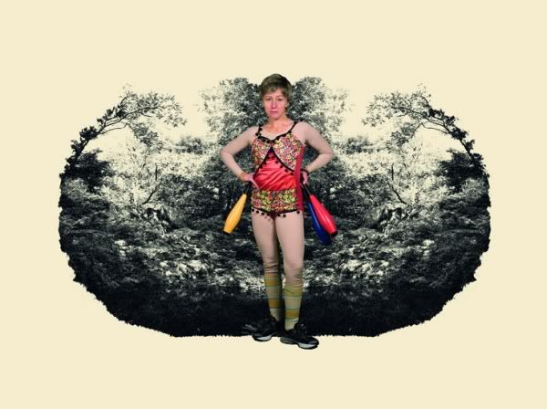
Sofie Alsbo, Tribe Absurdia
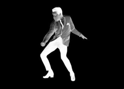
Josh Baum, Instrument for Reading Heraclitus
After all that good work reading Pound and thinking about what it means to criticise work, offer a judgement on the work and explain the judgement, I can't help but feel a bit blah writing about the Future Map show. I don't want to write a measured critique of the show. Even the thought of trying to explain why I thought it was all rubbish, uninspiring, backwards looking and dull bores me. Not exactly brilliant criticism, though is it.
But if this is what the future of art looks like - as decided by Ossian Ward, Alex Dellal, Paula Reed, and Judith Greer - then maybe a healthy injection of pessimism is no bad thing.
I didn't grab a price list as I could hardly see through the throngs of badly-dressed art students, but I reckon Cindy Sherman's new works showing at Spruth Magers cost a pretty penny. As, no doubt, do Edward Burtynsky's snaps of the Gulf oil spill that have just gone on show at Flowers on Cork Street. I don't know how much those cost either, as they ran out of price lists at Flowers and what's more - gasp! - their printer broke too so they couldn't print any more. Saved by faulty technology.

Cindy Sherman, courtesy of Sprueth Magers
I've never been a huge fan of Sherman, but her new work is ridiculous. It's bad. Very bad. And that's the nicest thing I can say about it. My advice is not to go. Don't put yourself through the hassle of getting on the tube, or hailing a cab, to the gallery. Stay at home where it's nice and wait until I find something better to send you to.
Burtynsky's photos at Flowers aren't terrible, but they certainly aren't his best. The photo in the gallery window is a beauty, though: an oil rig surrounded by an oil-slicked sea that looks like black, shoe-polished elephant skin. The greeny-blues of the oil slicks at rip tide just don't work as well. At his best - in the China and Quarries series' especially - Burtynsky combines the sweeping grandeur of large-format landscape photography with the idiosyncratic results of human intervention in the natural world. The problem with photos of oil in the ocean is that the photos just look like ocean. A shame, especially given the nature of the subject matter and the enormous potential to create a powerful emotional appeal for environmental responsibility. Unfortunately, these images don't make me feel anything at all.
I soldier on. Last night, optimism replenished, I skipped the Wallpaper Design Awards bash to go to the private view for Future Map, "showcasing the finest talent from University of the Arts London". UAL consists of: Camberwell College, Central Saint Martins, Chelsea College of Art, London College of Comms, London College of Fashion, and Wimbledon College of Art. I like to think my expectations were appropriately managed, but whoa, whoa, whoa, whoa, whoa. This was terrible stuff: dancing hairdryers, dancing Elvis, dancing water. What is going on here? The most depressing thing about it was that these projects and their artist owners were being sold as the cream of the UAL crop.

Sofie Alsbo, Tribe Absurdia

Josh Baum, Instrument for Reading Heraclitus
After all that good work reading Pound and thinking about what it means to criticise work, offer a judgement on the work and explain the judgement, I can't help but feel a bit blah writing about the Future Map show. I don't want to write a measured critique of the show. Even the thought of trying to explain why I thought it was all rubbish, uninspiring, backwards looking and dull bores me. Not exactly brilliant criticism, though is it.
But if this is what the future of art looks like - as decided by Ossian Ward, Alex Dellal, Paula Reed, and Judith Greer - then maybe a healthy injection of pessimism is no bad thing.


No comments:
Post a Comment