Monday 31 January 2011

Amelia’s Compendium of Fashion Illustration - competition

Why hello there, lovelies!

Photobucket

After a cracking weekend of Burns Night champagne dinners, brilliantly bonkers theatrics at the Barbican and a day of doing absolutely nothing other than eating and watching Babette's Feast (which is really very good), and then eating some more, I thought I'd spread and share a little happiness and give away some cool stuff.

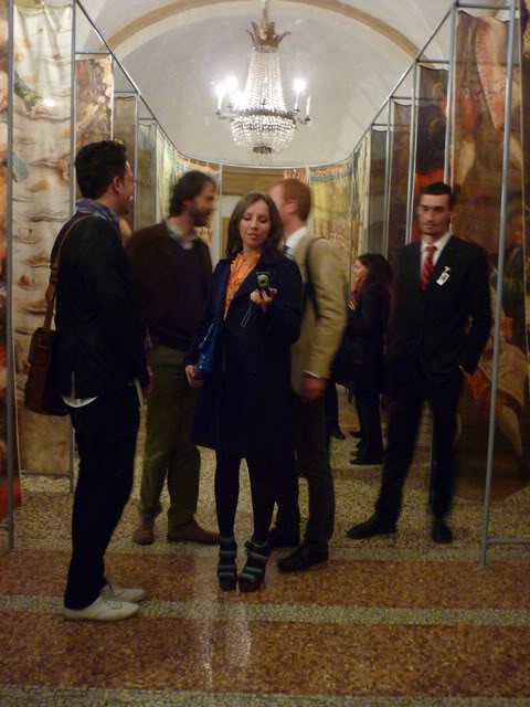
We went to the launch of Amelia's Compendium of Fashion Illustration (my, what a mouthful!), at 123 on Bethnal Green Road Friday afternoon. To launch her lovely new book (which you can buy here - with a sneaky 10% off using code ACOFI LAUNCH), Amelia lured invited bloggers and journos to the basement of 123 for a glorious tea party. To hand were steaming teas by pukka and mouthwatering scones by Lily Vanili, but best of all, Amelia had recruited her army of illustrators to bash out impromptu sketches of guests. We were drawn by the lovely Jenny Robins - she's sending through a copy soon, so I might post it in due course.

We were given sweet, screen printed gift bags on the way out, and because I really don't need anymore stuff, I thought it might be nice to do a little giveaway.

Photobucket

There are two bags, the contents of which are similar but slightly different.

Bag 1:
Canvas bag
Assortment of pukka tea bags
Assortment of Amelia's mag postcards and bookmarks
Limited edition Tatty Devine cutlass necklace
Limited edition Moleskine notebook with gold-embossed Amelia's logo
15% off at Dr. Hauschka online

Photobucket

Photobucket

Photobucket

Photobucket

Photobucket

Bag 2:
Canvas bag
Assortment of pukka tea bags
Assortment of Amelia's mag postcards and bookmarks
Limited edition reclaimed leather heart key ring
Limited edition Moleskine notebook with gold-embossed Amelia's logo
15% off at Dr. Hauschka online
Copy of the last issue of Amelia's magazine from A/W 2008

If you'd like to be in with a shot of winning one of the bags, leave a comment below or find me on Twitter (@crystalbennes) and RT away!

Last but certainly not least, a quick note of thanks to Forward PR who organised this terrific event. Not only were they militantly organised, but they were friendly, warm and gracious. Very very rare in the world of fashion PR.

Wednesday 26 January 2011

Fashion crush: Martina Austin Spetlova and Thomas Tait

Photobucket
Martina Austin Spetlova

Memory is a funny, fickle thing. During LFW, you see so much, so often that it becomes difficult to remember what you saw where and who designed it. Especially at the student shows where twenty odd graduates each present a capsule collection, even the most wildly divergent styles tend to meld into one.

At the time of the CSM graduate show last February, I really only remember being taken with Shao-Yen Chen's Marie Antoinette white mini-dress poodle puffs. Helpfully, a friendly blogger has complied a great list of all the students at the CSM show and when I looked again, two names caught my eye: Martina Austin Spetlova and Thomas Tait.
 

Photobucket
Shao-Yen Chen

I vaguely remember hhhhmmming contentedly to myself when both of these collections were presented, but seemed to have forgotten about them in all the rushing around thereafter, so it was nice to be recently reminded about the CSM show.

In my typical bipolar way, these two designers are at opposite ends of a spectrum with alien-angled bodymorphing dominatrix at one end and trampy Punky Brewster meets Rainbow Brite at the other.

Photobucket

Photobucket

Photobucket

Photobucket

Photobucket

Photobucket

Thursday 20 January 2011

visual inspiration: astronomy picture of the day

Photobucket
Saturn Storm Credit: Cassini Imaging Team, SSI, JPL, ESA, NASA; Color Composite: Jean-Luc Dauvergne

Unlike the more narrow scope of the UK undergrad educational model, as a liberal arts student at a large American university, despite the fact that I majored in political science (yeah, it seems weird now to me too), I had to take two years of a foreign language (French), macroeconomics (loathed it), a cultural diversity course (African-American literature in society, which I also loathed), English lit courses, some other things I can't really remember, and two years of a 'hard' science. Because I did lots of chemistry in high school I opted for organic and biochemistry instead of classes like Geology 101, i.e. Rocks for Jocks or Astronomy 101, which annoyingly doesn't have a catchily insulting slogan, but is also known to be an easy A for idiots. 

Though I was more than happy with the science courses I did take - I mean you don't get to pulverise beef heart and whiz it in a centrifuge to purify the protein in geology -  when a friend introduced me to NASA's astronomy picture of the day site, I felt a little cheated. I mean yeah, we got to make acetylsalicylic acid in one of our first organic chemistry labs (I was so excited that I convinced the lab tutor to let me smuggle the test tube full of aspirin home), but we never got to look at anything as splendid as the gorgeous spiral galaxy NGC 3521.

A new picture is posted on the site every day, but I like to let it pile up for a few days, sometimes a few weeks and then binge on a load all at once. Not only are most of the images astonishingly beautiful, but they make me feel so excited, so alive, so completely in awe of how incredible our universe is. I don't know about you, but a regular dose of that kind of amazement makes me feel far more jazzy than the caffeine from my morning coffee.

These are my favourite images from 2010.

Photobucket
Globular Star Cluster 47 Tuc Image Credit & Copyright: Dieter Willasch (Astro-Cabinet)
Photobucket
A Sun Halo beyond Stockholm, Credit & Copyright: Peter Rosén
Photobucket
NGC 7293 The Helix Nebula, Image Credit & Copyright: Ed Henry (Hay Creek Observatory)
Photobucket
Eclipsing the Sun, Image Credit & Copyright: Thierry Legault
Photobucket
Sunrise, Moonrise, Image Credit & Copyright: Robert Pölzl
Photobucket
NGC 3521 Close up, Credit: Data - Hubble Legacy Archive, ESA, NASA Processing - Robert Gendler  


ZECE6B7ZDWY4

Wednesday 19 January 2011

Gabriel Orozco at Tate Modern

Photobucket
Black Kites, 1997. © Gabriel Orozco. Courtesy Tate Modern.

When TJ and I arrived in Paris last October for our 20-hour Nuit Blanche art bender, we readied ourselves for the eve ahead with a can of coke and a cigarette. Sitting in the square outside the Pompidou, TJ noticed a camera on a tripod a few yards away. Obligingly, I went over to investigate. There were signs taped down in front of the camera instructing readers of said sign to pose for a self portrait. A camera remote sat nearby for just that purpose. We excitedly snapped a few too many silly poses before skipping off into the white night, but frustratingly, I never found out who the artist was or what the project was, or even whether the thing was an arts project at all.

On our way to Notre Dame, I remember we pressed our faces up against the glass walls of the Pompidou to reveal the secret of the shadows we could barely make out while walking past. In a large room, we saw a fan whizzing around with rolls of white toilet paper elegantly swooshing down like a rhythmic gymnast’s ribbon. We saw a Citroën DS with the middle cut out, then smushed back together like an oreo cookie without any filling. We both recognised the car but, between the two of us, we couldn’t manage the artist’s name. When the press release for the Gabriel Orozco show at the Tate Modern went round, the images clicked and I realised whose work we’d seen through the Pompidou’s windows.

I want to like this show. But I don’t. It depresses me. It’s like going on a first date with someone whose photos you’ve only seen on Facebook. Online, he’s not half bad; a bit pretty, witty messages. But when you’re across the table at The Ambassador, his prettiness is nice enough and his chat’s alright but by the time the starters have been cleared away the conversation’s flagging and relatively pretty just isn’t good enough. It’s not that this show is offensive or tedious or really, truly horrible, but that it’s empty. Like my terrible blind date metaphor, it’s empty but trying to hint at meaning through tired clichés.

Relativism’s such a pain in the ass. It’s done the art world little good. The nightmare that is post modernity resulted in an approach that says it doesn’t matter what’s ‘good’ or ‘bad’ because everyone’s opinion is equally valid. I’m open to being wrong, but this strikes me as a load of old hair-loss replacement bollocks. Sure, we don’t all have to agree on what’s ‘good’ – there would hardly be a need for art if that were the case – but criticism by its very definition must assume that some works of art are more worthy than others. Contrary to relativistic dogma, it’s a critic’s job to make judgements, but the increasing power of institutions and PRs means that most ‘criticism’ tends to be expressed as art history or back-slapping positivity. Not that either of those are intrinsically bad – I love a good bit of back-slapping positivity and I love being excited about things – but reading the newspapers, magazines, and even blogs, you’d think that every single art show was an absolute masterpiece.

I’m getting a little side tracked.

One of Orozco’s more visually striking pieces, Black Kites, is a human skull with a drawn on black and white geometric pattern. The skull is wonderful to look at, briefly, but it has no power as a work of art. It solicits no emotional response, no feeling; it’s like looking at a trinket in a curiosity shop. So you can understand why I’m not comfortable when critics and curators say things like: ‘the skull, an organic reality, engages with and parries the attempt of the artist to impose a system, a sense of regularity and order.’ Why do people still write like this? What does ‘organic reality’ even mean? Here the truism holds that clouded language denotes clouded thought: such a statement entirely neglects the fact that nature has its own set of systems and rules, its own order. A black and white pattern isn’t ‘reason’ to the skull’s ‘uncertainty’.

I look at Black Kites and I see a skull with a pretty pattern on it. That’s it. Nothing more. It doesn’t make me think about life, art, death, desire; but what Dave Hickey calls 'scholastic post-minimalism - "fast art" designed for the institutional, white-box quick-take.'

With so many of Orozco’s works, the concept or process has been privileged – chopping the middle out of a Citroën DS and putting it back together, tracking down matching yellow scooters to photograph them as a pair, filling a chess board with nothing but rooks, displaying an empty shoebox, taking photographs of the steam of breath on a piano, extracting amusing phrases from obituaries to write out on banners – to the detriment of the visual effect of the physical work.

There’s nothing here to look at. In effect this exhibition is a promenade piece: it’s contemporary art that’s the product of a society with no attention span. You can amble through the entire show without stopping to pause for a single sustained look.  Hickey again perfectly encapsulates my desire for more than just food for thought: ‘I want an image that I can keep looking at, some kind of sustained eloquence, an image that perpetually exceeds my ability to describe it.’

This probably isn’t the place to get into a discussion about the importance of beauty, and I mean beauty as something that provokes a physical response, not simply as a box-ticking set of aesthetic guidelines, but art needs more than surface tricks to mean something, to move someone. It’s no good if you look at the work, aren’t moved, then read the explanatory text and feel more intrigued by the conceptual underpinnings of the work rather than the finished piece itself. This art has no power.  Orozco’s pieces aren’t persuasive. They don’t demand my attention or evoke a physical response. Witty though much of his work may at first appear, to me it just isn’t interesting.

Tuesday 18 January 2011

Ross Sutherland: Experiment to determine the existence of Love + Shortcut


This is Ross Sutherland. He is awesome. His poems are excellent.

Buy his new book, Twelve Nudes.

I receive no commission from Penned in the Margins.

None at all. 

I just like good poetry.

Thursday 13 January 2011

State of the art: Cindy Sherman, Edward Burtynsky, Future Map 10

Photobucket
Edward Burtynsky, Oil Spill #5, Q4000 Drilling Platform, Gulf of Mexico, June 24, 2010, courtesy Flowers Gallery

I'm an optimist by nature. Probably also by nurture, but the point still stands. I like liking things. But I like the things I like to be good. Really good. Most people who know me assume that good means expensive, but here, at least, I can correct such ill-informed assumptions. 

I didn't grab a price list as I could hardly see through the throngs of badly-dressed art students, but I reckon Cindy Sherman's new works showing at Spruth Magers cost a pretty penny. As, no doubt, do Edward Burtynsky's snaps of the Gulf oil spill that have just gone on show at Flowers on Cork Street. I don't know how much those cost either, as they ran out of price lists at Flowers and what's more - gasp! - their printer broke too so they couldn't print any more. Saved by faulty technology.

Photobucket
Cindy Sherman, courtesy of Sprueth Magers


I've never been a huge fan of Sherman, but her new work is ridiculous. It's bad. Very bad. And that's the nicest thing I can say about it. My advice is not to go. Don't put yourself through the hassle of getting on the tube, or hailing a cab, to the gallery. Stay at home where it's nice and wait until I find something better to send you to.

Burtynsky's photos at Flowers aren't terrible, but they certainly aren't his best. The photo in the gallery window is a beauty, though: an oil rig surrounded by an oil-slicked sea that looks like black, shoe-polished elephant skin. The greeny-blues of the oil slicks at rip tide just don't work as well. At his best - in the China and Quarries series' especially - Burtynsky combines the sweeping grandeur of large-format landscape photography with the idiosyncratic results of human intervention in the natural world. The problem with photos of oil in the ocean is that the photos just look like ocean. A shame, especially given the nature of the subject matter and the enormous potential to create a powerful emotional appeal for environmental responsibility. Unfortunately, these images don't make me feel anything at all.

I soldier on. Last night, optimism replenished, I skipped the Wallpaper Design Awards bash to go to the private view for Future Map, "showcasing the finest talent from University of the Arts London". UAL consists of: Camberwell College, Central Saint Martins, Chelsea College of Art, London College of Comms, London College of Fashion, and Wimbledon College of Art. I like to think my expectations were appropriately managed, but whoa, whoa, whoa, whoa, whoa. This was terrible stuff: dancing hairdryers, dancing Elvis, dancing water. What is going on here? The most depressing thing about it was that these projects and their artist owners were being sold as the cream of the UAL crop.


Photobucket 
Sofie Alsbo, Tribe Absurdia

Photobucket
Josh Baum, Instrument for Reading Heraclitus


After all that good work reading Pound and thinking about what it means to criticise work, offer a judgement on the work and explain the judgement, I can't help but feel a bit blah writing about the Future Map show. I don't want to write a measured critique of the show. Even the thought of trying to explain why I thought it was all rubbish, uninspiring, backwards looking and dull bores me. Not exactly brilliant criticism, though is it.

But if this is what the future of art looks like - as decided by Ossian Ward, Alex Dellal, Paula Reed, and Judith Greer - then maybe a healthy injection of pessimism is no bad thing.

Monday 10 January 2011

no new books

Photobucket

Some people make resolutions. I make to-do lists. So, I suppose you could say that I spend most of the year making resolutions, even if they're more micro than macro. This year, however, I thought I needed to go big for 2011. One resolution to rule them all. Perhaps I ought to resolve not to write so much nonsense, but that just ain't gonna happen. Instead, I've resolved not to purchase another new book until I've read all those I currently own. You might not think this sounds tough, but it's like asking Jeffrey Bernard to give up booze and horse racing at the same time. I love smelling books, looking at books, reading books, talking about books, talking about books I haven't even read; but most of all, I love buying books.

I decided I needed a system, so I spent one evening last week alphabetising all my books by title (how about that for a glamorous life). Even though I'm supposed to be finishing Derrida's Writing and Difference, I got all excited and started reading the first book on the shelf - Ezra Pound's ABC of Reading - last week.

I've mixed feelings about Pound. I can't really get into The Cantos but Diptych Rome-London is brilliant. It doesn't much matter how I feel about his poetry, though, as ABC of Reading (1931) is prose, glorious prose. It's a brilliant read, chock full of pithy arguments and amusing aphorisms, and the perfect way to set up the rest of the books to come.

Some of my favourite bits and pieces:
     The critic who doesn't make a personal statement, in re measurements he himself has made, is merely an unreliable critic. He is not a measurer but a repeater of other men's results.
     KRINO, to pick out for oneself, to choose. That's what the word means.

     This is nevertheless the RIGHT WAY to study poetry, or literature, or painting. It is in fact the way the more intelligent members of the general public DO study painting. If you want to find out something about painting you go to the National Gallery, or the Salon Carre, or the Brera, or the Prado, and LOOK at the pictures.
     For every reader of books on art, 1,000 people got to LOOK at the paintings. Thank heaven!

     AT ABOUT THIS POINT, the weak-hearted reader usually sits down in the road, removes his shoes and weeps that he 'is a bad linguist' or that he or she can't possibly learn all those languages.
     One has to divide the readers who want to be experts from those who do not, and divide, as it were, those who want to see the world from those who merely want to know WHAT PART OF IT THEY LIVE IN.

     This is where the so-called crack-brained genius comes in. The concept of genius as akin to madness has been carefully fostered by the inferiority complex of the public.

     I mistrust the man who starts with forty-nine variants before stating three or four principles. He may be a very serious character, he may be on his way to a fourth or fifth principle that will in the long run be useful or revolutionary, but I suspect that he is still in the middle of his problem, and not ready to offer an answer.
     The inexperienced teacher, fearing his own ignorance, is afraid to admit it. Perhaps that courage only comes when one knows to what extent ignorance is almost universal. Attempts to camouflage it are simply a waste, in the long run, of time.
The only other problem with my resolution is that I'm a very spider's web sort of person. If I read something in one book that sparks my interest, I immediately want to go out and investigate. So when Pound reproduces a little passage by Lord Rochester -
Were I (who to my cost already am
One of those strange prodigious Creatures, Man)
A Spirit, free to choose for my own share,
What sort of Flesh and Blood I pleas'd to wear,
I'd be a Dog, a Monkey, or a Bear,
Or anything but that vain Animal,
Who is so proud of being Rational.
- I want to go out and buy a volume of Rochester straight away. But I can't, because I've resolved... You see the gaping hole in my oh-so clever plan. Alas and oh well. One down. Plenty more to go.

Happy new year!

Photobucket